BEN MEAD

Game Designer, Programmer, 3D Artist


Scroll to see more


Ben Mead

Game Designer, Developer and 3D Artist aspiring to continuously learn from and connect with others. I graduated with a Bachelor of Design (Communication) 2024. With the experience of multiple in-course and out-of-course projects under my belt I have developed worthy skills in Game Design, Unity Game Development, C# Programming, 3D Modeling with Blender, Adobe 3D Substance Painter and even a little bit of Figma.The passion I hold for creating the most enjoyable experiences stems from an innate urge to constantly form connections. This aspect of my personality is more visible when viewing my extracurricular life, in which I am an Executive Member and Team Manager for a local volleyball club. This community engagement only helps to fuel my desire to collaborate with others.In the future I aim to travel the world, creating meaningful experiences and learning from everyone that has skills to pass on. I aim to design games that can bring other people as much joy as they do me, and allow other people to form meaningful relationships with the people around them.


CAPSTONE PROJECT

Pocket Parry

July 2024 - October 2024
Solo Developer

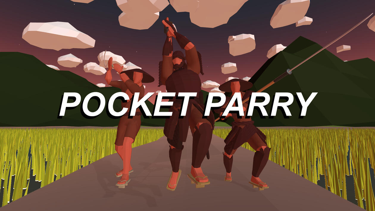
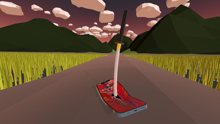
A Unity Based 3D Hyper Casual Mobile Game that takes parry mechanics to a whole new level! Experience immense satisfaction in a short yet challenging game play experience.

Related article

Pocket Parry
User Experience Post Mortem

A post mortem report on the User Experience performance of my capstone project Pocket Parry

TEAM CLIENT PROJECT

Snowball Slam : World Tour

Feb 2024 - May 2024
Game Designer, 3D Artist, Developer

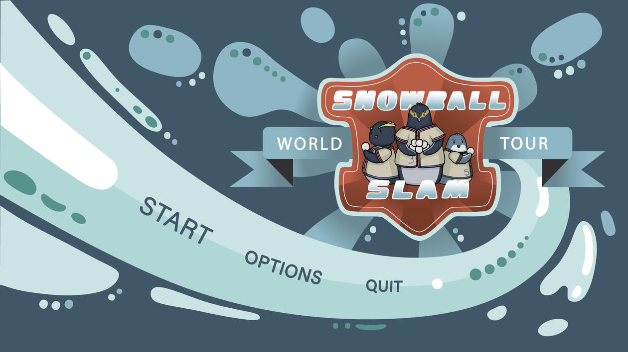
A 3D Couch Coop Game where the players, as a group of Aotearoa Penguins, take on the world's best in a series of snowball fighting challenges.


TEAM GAME PROJECT

Cloudscape

July 2023 - Oct 2023
Game Designer, Artist (3D/2D), Developer, Programmer

Follow the adventures of a trio of friends exploring the lost wonders of the clouds. In this 3D Adventure, hack and slash your way through unique enemies to discover the unknown fate of an ancient civilization.


TEAM GAME JAM

Dino Defense

Oct 2023 - Nov 2023
Game Designer, Programmer, Developer

Dino Defense is a 2D Mobile Base Builder Game where the player must utilize defensive structures to protect their Dinosaurs from a series of cataclysmic events as they progress their evolution throughout time.


Other work

Blackheart

Hyporeal Ltd

blackheart

Office Overtime

Uncanned Games Ltd

officeovertime

Pocket Parry ux post mortem

Preface

The purpose of this post mortem is to expand my skills and understanding of User Experience (UX) design by self-evaluating a game project, showcase my UX comprehension as a designer and to display my reception to constructive criticism and respective iteration.

Introduction

Pocket Parry is a 3D mobile hyper casual parrying simulator game made in the span of twelve weeks as a degree capstone project. It is designed with heavy inspiration from the Soulsborne series and as such is intentionally quite a difficult game. Relying on precise attack reading and fast reaction speed, the player needs to be laser focused on the gameplay. The two main features being evaluated as part of this post mortem are the User Interface (UI) and the Core Gameplay (incl. Controls)

Acknowledging the twelve-week project timeframe and limited resources, many planned features were either shelved or significantly simplified to ensure a satisfying and challenging demo game within the scopeThe evaluation of each feature will be broken down into three core UX principles; Usability, User Feedback and Onboarding.

Feature #1 - User Interface

One of the main constraints for designing the UI was that it must be simple, easy to use/understand and, most importantly, it must not get in the way of gameplay and create visual clutter. This design constraint ties in directly with the challenging mechanics and the importance of being subtle enough so as to not interfere with the gameplay area.Due to time constraints and unforeseen setbacks in the development process, the scope for the design of the UI had to be severely reduced.In terms of usability, there are positives and negatives. The reduced scope for the UI meant that the end result ended up being somewhere along the lines of a high fidelity wireframe. The positive aspect of this is that a lot of the elements ended up being simple text elements 一 an effective way of communicating functionality expectations to the user. The drawback on this is that there is a clear lack of aesthetics and it tends to detract from the experience slightly in certain areas; Pictured in figure 1.0 is a screen in the tutorial explaining the omni directional input system that the game uses.

figure 1.0 - tutorial screen

figure 1.1 - gameplay UI

figure 1.2 - proposed campaign tracker solution

Another negative example of usability within the UI, illustrated at the top of figure 1.1, is the ‘Campaign Progress Tracker’ element. Whilst maybe not immediately noticeable to the untrained eye, for anyone with basic Unity experience it is obvious that default interface elements have been used. The placeholder elements utilised in this panel fail to communicate a clear function and have been known to confuse users about the purpose. Sketched in figure 1.2 is a potential solution; By placing each subsequent enemy in a queue behind the current opponent, the player can clearly see how far into the level they are and as such their progress.A positive aspect of the interface that highlights good usability are the heart icons located in the bottom left of figure 1.1. These are a well known and familiar inclusion within many video games, employed frequently to show the player their current health status (as can be seen exemplified in figure 1.3). This familiarity makes it immediately clear to the user what the purpose is, and what information is displayed through the element’s implementation.

figure 1.3 - hearts UI comparison

figure 1.4 - leaderboard loading bar

figure 1.5 - endless button greyed out

In terms of User Feedback, there is a degree of disconnect within the UI resulting from time constraint. The lack of interaction audio cues and effects led to an overall poor experience for the user in terms of reception. For example, a player might expect to hear a series of sound effects in scenarios such as selecting a level or recentering the map position.There are a few, limited cases where clear feedback has been presented to the user, one such can be seen in figure 1.4. The leaderboard interface for the endless gamemode takes a moment to process, to counter this a small loading circle provides a logical placeholder until the leaderboard can be properly displayed.The last aspect of UX to consider in the evaluation of the UI is onboarding.Due to their simplicity, the text based UI elements (shown in figure 1.1) provide a straightforward description of their function. Learning the UI becomes self-explanatory enough that a seamless learning curve is guaranteed.The only slight exception to this is exemplified in figure 1.5. When selecting a level there are two potential options to select; campaign and endless.The endless option initially appears greyed out as it is locked until the campaign is completed. However this was not communicated clearly enough, leading many first time users to attempt clicking the endless button anyways.

Feature #1 - Core Gameplay & COntrols

The second and final key feature evaluation will be a summarisation of the main gameplay and controls. Having taken inspiration from the Soulsborne series, core expectations of being challenging, easy to understand as well as infectiously satisfying, were set from the beginning of development.Keeping it easy to use but retaining the ability to create an adequate amount of challenge led to the creation of the eight direction input system. One repetitive player action with eight different outcomes provides enough room to have an enjoyable and replayable variety of opponent attacks.The relatively complex functionality of said input/control scheme was initially designed around the inclusion of a settings menu. Briefly explaining how the system works; Swiping on the screen draws a line with a certain gradient which is then compared to set gradients on a divided circle. Depending on which section the input gradient matches, a direction is called. The settings menu pictured in figure 2.0, allowed the user to control the gradients of the section dividing lines. This in turn modified the input regions and enabled the user to tailor the mechanic to their advantage.The settings menu feature is a great example of player agency and accessibility within the UX of Pocket Parry. By enabling a user to freely control/customise the input system to their needs, they are able to iterate on their own personalised experience. However, due to time constraints, flawless implementation was out of scope thus leaving the input system in a state of hardcoded ‘it’s good enough’.

figure 2.0 - settings menu interface

Problems arose in terms of usability when Pocket Parry was played on devices with varying aspect ratios. For example, users initially assumed that a correct top left input would be to drag towards the top left corner of their screen. This however was incorrect because of the hard coded input zones.Post project submission this mistake was rectified by rewriting the input zone gradients to be calculated based off of the screen resolution. Dividing the screen up into eight equal sections, accurate to the aspect ratio. Once implemented this proved to be a much needed change as it immediately made the inputs much more accurate to the user’s intentions.The only other key issue regarding usability within the core gameplay is entirely user dependent. Games are made with specific target audiences in mind, Pocket Parry’s being the Soulsborne audience. With limited ability to showcase the game to the intended demographic, much of the overall received feedback was skewed in the direction of the mechanics being too hard.It could be considered poor usability in failing to make the game accessible to a larger audience, but to that end it shall be said, “Skill Issue”. Humour aside, a few testers who belong to the target demographic expressed enjoyment out of the overall experience; with one player reporting having played the game for a week, communicating their joy and sense of accomplishment over beating the campaign level.To recreate the day-one expectation of satisfaction when overcoming tough foes, the vertical slice prioritised basic user feedback through sound and visual effects. This was a strong highlight of the overall UX in Pocket Parry.In a Dunedin Game Developer meetup, guest speaker Tana Tanoi described the importance of a minimum viable product (MVP) actually being a minimum enjoyable product. By prioritising features that make up the satisfaction of the main mechanic it is much easier to find early passion in a game project. Once it became clear that an MVP didn’t have to consist only of working mechanics with dodgy programmer art, it was much easier to meet the user feedback expectations early on in the timeline.

One more strong UX highlight of Pocket Parry is in the way it communicates to the player how they are performing through User Feedback. When the player does not successfully deflect an attack, there will be multiple SFX as well as visual cues informing the player both that they’ve taken damage and in which direction the attack came from. On a successful input, there are two different indicators that the user can receive. The first, a parry, happens when the attack and input timings are within a certain duration apart, initiating both a satisfying particle system and an audibly rewarding clang sound effect. The alternative in the case the input is successful, but the timing is slightly too early, is a block 一 an ultimately less satisfying particle system with more dull sfx. Pictured in figure 2.1 is a comparison between the two particle systems.

figure 2.1 - comparing block and parry vfx

Taking a look at the finisher mechanic, shown in figure 2.2, another solid example of user feedback can be seen. This mechanic was designed to add another level of progression to the gameplay, whilst providing an opportunity for the player to regain health after successfully defeating an enemy. Once an enemy has run out of composure a random combination code is generated. The player must then input the combination code using the input system, succeeding if doing so within a set time frame. At this stage of the mechanic a successful input turns the respective input arrow green, and an incorrect input turns it red. If the code is completed an animation will play, followed by a satisfying particle effect and the opponent exploding. In the case that the player fails the finisher, there will be no animation, and the opponent will instead ragdoll.

figure 2.2 - finisher mechanict

The satisfaction from this brought players another level of enjoyment and they appreciated the addition of health regeneration, a significant bonus considering the difficulty.Despite this, there were a couple of aspects within the finisher mechanic that were a little unclear and had occasionally confused users. If they were to get one of the inputs in the combination code wrong, it would appear red with no added indication to the player that they could try again. This led to a few players getting a single input wrong and subsequently giving up immediately. Another shortfall was that if the player failed the finisher completely there was nothing to communicate that other than the enemy ragdolling in front of them, which by itself was inadequate. Overall a couple of minor, unclear cases in the mechanic that could definitely have been adjusted for better usability and enhanced user feedback.Lastly in regards to onboarding; for users who may not have resided within the target demographic, the main drawback was the steep learning curve and coinciding difficulty. Repetitive failure with limited progress was a common issue for many that tested the game, leading to a sharp dropoff of player retention within the first few minutes of gameplay. Whilst the game is intended for a specific audience that would enjoy the difficulty, there were measures that could have been taken to make the experience more gratifying for a wider demographic.One thing that did help a lot of players initially was the inclusion of the tutorial. Being shown what the expectations are for the gameplay and then having a mandatory free practice seemed to be of a positive benefit. The only downside of this was that most players would not quit back to the menu after losing, which led others to miss the tutorial and immediately jump into the level.A mistake that proved impactful and was previously explained in this report was the issues with the hard coded input system. In an onboarding sense it made it much harder for players to get the hang of the correct ways to swipe for certain directional inputs and overall led to less retention.

Summary

To summarise the findings of this report, the key positive aspect of the UX was in the core gameplay mechanics. The expectations that were set at the start of the project were met accurately as a satisfying and challenging, short form gameplay experience was created. On a more constructive note, there could have been more time allocation dedicated towards the UI and going forth that will be something to consider when approximating a development timeline. Finally, to cover the issue of difficulty, arguments have been made previously within this report for both the cases of catering an experience towards more users versus “Get good”. However to quote Arrowhead Studios “A game for everyone is a game for noone”. In short, not everyone can be pleased, so have a target audience and stick to it.


Pocket Parry

A lone samurai warrior must battle their way through a series of strong foes, utilising their reaction skills to deflect
the opponents attacks and break their composure. After destroying their spirits, the solo challenger has the opportunity
to revitalise by finishing of the opponent with a satisfying flourish.
How long can they survive...?

Pocket Parry is the finale to my degree, a solo project I undertook to fully experience the depth of my skills in action, limited only
by the twelve week time constraint.
As the sole developer in this project I did everything from Designing and Programming the Game Mechanics, to 3D Modelling and Animating the Characters.

gameplay showcase

Gallery

GO GIVE IT A TRY ON ITCH!

3D WORK

Links


Snowball Slam : World Tour

A team of professional snowball fighters, who also happen to be native Aotearoa penguins, challenging other snowball fighters in a tour of the globe’s best. Play against different types of animals over multiple continents in order to establish international snowball supremacy.

My role in this project was somewhat broad but seemed to encapsulate mostly the following; 3D Modelling in Blender, General Game Design, Unity Game Development, C# Programming for Unity.

gameplay showcase

Gallery

3D WORK

Links


Cloudscape

Follow the Adventures of a trio of friends from Devotio Village as they discover the unknown fate of the Lands of Anathema.
Venture into the clouds and explore Roguelike towers, battling through warriors tainted by a mysterious curse.

My role in this project covered a great many disciplines; Game Designer, Game Developer, Programmer & Artist. I utilised a lot of specialised software in the development of Cloudscape, however it provided a great learning curve in terms of both Game Design ( Scope ) and C# Programming.

gameplay showcase

Gallery

Links


Dino Defense

Dino Defense is a 2D Mobile Base Builder Game where the player must utilize defensive structures to protect their Dinosaurs from a series of cataclysmic events as they progress their evolution throughout time.

This project was initially designed to be a collaboration between disciplines, but after that fell through I was semi-forced into being the lone Unity Developer / Programmer. As this was only a four week project this was a good test of skill and efficiency in a short time frame.

Gameplay showcase

gallery

Links


Contact

If I sound like someone you want to work with, please get in touch. I’d love to hear from you and kick off an exciting partnership.Email : [email protected]